kentik Product Updates logo
Back to Homepage Subscribe to Updates

Product Updates

Latest features, improvements, and product updates on Kentik's Network Observability platform.

Labels

  • All Posts
  • Improvement
  • Hybrid Cloud
  • Core
  • Service Provider
  • UI/UX
  • Synthetics
  • Insights & Alerting
  • DDoS
  • New feature
  • BGP Monitoring
  • MyKentik Portal
  • Agents & Binaries
  • Kentik Map
  • API
  • BETA
  • Flow
  • SNMP
  • NMS
  • AI

Jump to Month

  • April 2025
  • March 2025
  • February 2025
  • January 2025
  • December 2024
  • November 2024
  • October 2024
  • August 2024
  • July 2024
  • June 2024
  • May 2024
  • April 2024
  • March 2024
  • February 2024
  • January 2024
  • December 2023
  • November 2023
  • October 2023
  • September 2023
  • August 2023
  • July 2023
  • June 2023
  • May 2023
  • April 2023
  • March 2023
  • February 2023
  • January 2023
  • December 2022
  • November 2022
  • October 2022
  • September 2022
  • August 2022
  • July 2022
  • June 2022
  • May 2022
  • April 2022
  • March 2022
  • February 2022
  • December 2021
  • November 2021
  • October 2021
  • September 2021
  • July 2021
  • June 2021
  • May 2021
  • March 2021
  • February 2021
  • January 2021
  • December 2020
  • October 2020
  • September 2020
  • June 2020
  • February 2020
  • August 2019
  • June 2019
  • April 2019
  • March 2019
  • February 2019
  • January 2019
  • December 2018
  • November 2018
  • September 2018
  • August 2018
  • June 2018
  • May 2018
  • April 2018
  • March 2018
  • February 2018
  • January 2018
  • December 2017
  • November 2017
  • October 2017
  • July 2017
  • June 2017
  • May 2017
  • April 2017
  • March 2017
  • February 2017
  • January 2017
  • December 2016
  • November 2016
  • October 2016
  • April 2016
ImprovementHybrid Cloud
3 years ago

Cloud: June/July 2021 Update

The Hybrid Cloud observability feature set in Kentik Portal makes a big leap forward these June and July months, with a special focus on Amazon Web Services features, read on !


AWS Entity Explorer

A quiet but mighty addition to our product, the AWS Entity Explorer puts important network metadata at our user’s fingertips. You might not know it, but the details that dictate how cloud networks behave are buried behind APIs or inside cloud interfaces — which were built for automated consumption — and certainly not for solving problems for network engineers. With this new feature, engineers can answer questions like “What VPC is this internet gateway associated with?”

Features include:

  • Instantly find any network element using our quick search utility. Search on owner IDs, entity IDs, tags, and names.
  • Jump from gateways to attached VPCs to quickly navigate around complex metadata.
  • Our new “Open in Map” feature allows users to quickly locate and understand how infrastructure is placed within their environment.
  • Open cloud networks elements in Quick Views and Data Explorer.

Support for Peered Transit Gateway Traffic Queries

The Transit Gateway in AWS continues to stymie network engineers trying to get a handle on how their traffic is routed within their AWS cloud network. Our original implementation of TGW support only looked at traffic that had originated on a directly-attached VPC. However, Transit Gateways can be peered with each other — meaning that a single Transit Gateway can actually be forwarding traffic to or from an adjacent Transit Gateway. Being that we are awesome, and because we are the only network observability company with a solution to monitor traffic through Transit Gateways, we solved this problem by writing an algorithm that discovers peered Transit Gateways — so you can always see the correct amount of traffic flowing to or though your TGWs.

AWS “Show Path” Feature

A truly kick-ass, differentiating feature for Kentik Cloud. Understanding how traffic flows from one VPC to another over a cloud network is truly a painful experience — one that has network engineers switching back and forth between their command lines and the AWS console for minutes before arriving at a simple answer. The AWS Show Path feature eliminates this pain and replaces it with an intuitive, complete and beautiful way to see paths between sources and destinations in the cloud.

Show Path works across peering connections, transit gateways, over direct-connects and site-to-site VPNs and also works locally, within a VPC. The feature elegantly handles default and covering routes by suggesting specific routes from adjacent devices ensuring that the path drawn is as complete as possible.

AWS Configuration Status

One thing that has become clear over the last few months is that we need to continue to strengthen our ability to quickly and easily onboard AWS flow logs and metadata. However, with the multitude of architectures we support and data + flow logs coming in from tens or sometimes hundreds of different sources per customer, we never had a way to concisely convey the health of a customer’s Kentik implementation… until today.

The AWS Configuration Status page aims to make this easier by helping users get an at-a-glance overview of how complete (or incomplete) a customer’s AWS/Kentik configuration is. For each region that a customer has configured an export for, we extract the account ID, and display a high-level overview of the API and Flow status. Clicking on a row allows customers to get more details such as a listing of exactly which APIs our system requires and a success state for each. Warning messages are detailed and complete on the mouseover. Below the APIs, we enumerate the flow logs configured for each entity within a given account/region and flag any accounts that don’t appear to have flow logs configured such that Kentik could ingest them.

Search Feature for Kentik Map + Performance Monitor

Building a map for large customers with hundreds or thousands of accounts is definitely possible, but doesn’t always result in the most useful of visualizations. That’s why we added a search and filtering feature to both the Kentik Map and the Performance Monitor. This feature allows users to quickly find ‘needle in the haystack’ entities like VPCs, subnets, and gateways. Our search intelligently recognizes the format of each search string entered and builds a complex search query that can be saved for quick reuse.

Support for External ID

At the request of one of our customers, we’ve added support for External IDs in the API and S3 calls that we initiate to AWS. External ID helps protect our customers from “Confused Deputy” attacks that could allow our service to be abused by malicious 3rd parties to attack our customers. (We don’t believe that the access we request could ever be used in such a way, but better safe than sorry!) As this feature has become more front-and-center in AWS’ role configuration dialogs, we are glad to support this enhancement. The feature now injects a unique string per customer with each request that we send to AWS. This string is set to be the Kentik customer CID.

Avatar of authorChristoph Pfister
ImprovementSyntheticsNew featureBGP Monitoring
3 years ago

Synthetics: June/July 2021 Update

New App Agents

We released a new set of agents that will enable tests at the application layer. These are what we’re calling “App Agents” and they are capable of running a full headless Chrome browser instance. These agents will enable us to offer our customers tests like Page Load tests and Transaction tests. When used in conjunction with our rich network layer functionality, these new agents and test types will allow network engineering and network operations teams to quickly determine if the issue is at the network layer or at the application layer.

Full Browser Page Load Test

We activated the Page Load Test type that performs a full browser page load using the new App agents.

  • The new test type can be set up by clicking “Page Load” under “Web Tests”
  • Agent selection uses the new App agents but this is seamless to the end user.
    • Once in the test setup, clicking the “edit agents” button will only display the App agents in the list (that is currently a subset of all locations but growing to include all currently supported locations).
  • The test set up is similar to the HTTP or API test except:
    • It performs a full browser page load (while the HTTP test stops after the page contents are retrieved using a GET)
    • Only includes GET option (since it is a page load). Does not include ping and trace alongside the page load (we have plans to support that in the future).
  • The results are presented in a similar fashion to the HTTP or API test, with the following differences:
    • Table columns include new “DOM Processing Time” and “Navigation & App Cache” that are specifically relevant to the time taken for the browser to load and display the contents of the page respectively

BGP Route Viewer

BGP Route viewer is the first of a series of capabilities planned to help proactively monitor BGP-related conditions that can impact performance. In response to customer requests and feedback, we have developed a comprehensive roadmap for BGP monitoring, and we believe our solution will have significant performance advantages over alternative solutions.

The first part of Kentik’s solution is BGP Route Viewer. BGP Router Viewer appears as a tab along with the existing SaaS and Cloud Performance tabs. For customers who have entered prefixes in their Network Classification settings, we will automatically load BGP update data for those prefixes in this tab. For customers who have not entered any prefixes in their Network Classification settings, we will show an interface that allows you to do so and give you the option to save the entered prefixes to the Network Classifications page.

HTTP Stage Timing and Charts

With the new Page Load tests, results can be plotted in a time series along with HTTP stages and the timing for each stage. This new view helps network teams isolate network layer issues from HTTP layer issues.

Major Path UX Overhaul

The (traceroute driven) path experience has been one of the most valued features of Synthetics and while it works well, we felt like we could go back and revisit the design holistically after having added a bunch of small and big features iteratively since it first launched (back in November). The updates we made can be summarized in two main buckets:

  1. Improve the overall usability of the product/feature by:
    • Reducing the number of clicks to do things (like setting the thresholds and other config knobs)
    • Reducing the quantity of information presented on default load (intelligently collapsing things to reduce information overload)
    • Reducing the amount of whitespace used so it is more compact and requires less or no scrolling
    • Preventing the path from exceeding the bounds of the page
    • Avoiding the side pane (which required knowing that one should click and would cover a third of the path when open)
    • Remove the ping-driven health timeline, as this data does not necessarily correlate with latency seen on the path and can lead to confusion.
  2. Support collapse/group by sites. This has been requested by a few customers, particularly ones that run tests within their own network and find the ASN option of less use (everything collapsed into their ASN). Having the ability to group by sites lets these customers know if a path change caused traffic to go through a different site instead of the expected/desired one.

Here is a list of the main changes:

  • Health timeline is removed from path tab. It was ping-results driven and could confuse users when it showed issues, but no issues were present in the path. (The path is trace-probe driven, which may not show the same issues for short-lived spikes.)
  • All group/collapse functions (ASN, left/right) have been rolled into one main “Group by” selector and the option to group by “Sites” has been added.
  • Copy for geodistance-based latency comparison has been improved and helper text/icon added.
  • Option to “Reset” everything back to default quickly has been added.
  • The ASN legend has been moved below the path UI and is displayed in a line, moving the path higher up in the page and reducing the amount of whitespace.
  • The main path trace visualization has received the most significant overhaul and results in a much less overwhelming and much more fluid experience than before. Highlights include:
    • Extra effort has been put into avoiding overlapping traces that cross other traces and make the overall UI very busy and confusing.
    • You can hover over any node (without needing to click) and it will show you all the information available.
    • Similar to the node hover, hovering over an agent (source) or target will show you all the information cleanly organized in sections, and will give you a link to view the raw traceroute output. There is also an option to quickly collapse nodes for this or other agents with just one click, right there.
    • Previously we would only show latency for (red) links that exceeded the threshold and packet loss for (red) nodes that exceeded that threshold. Now this information is shown for all nodes and links. In cases where the metrics exceed the threshold, a red font is used to highlight. Further, previously high packet loss nodes were identified with a full red circle, which was confusing if there was an ASN with a similar color. Now this is made clearer with a red border.

Density Grid Groups Dashboard

In response to customer feedback, we have added a new type of visualization option under Synthetics in the dashboards (library) portion of the product. One of the key use cases is customers who set up DNS servers by zones and want to see a global view of the performance of their whole DNS infrastructure.

  • Select “Add” a “Synthetics Test View” dashboard element and then pick the new “Density Grid Group” allows you to multi-select any tests configured in the system that are of type “DNS Grid” or “Network Grid.”
  • Select a few tests and save the widget to display agents in the first column and then test results aggregated by target in the columns to the right of that.
  • For each cell in the results, each square represents that specific agent hitting one DNS server to resolve the specific target.
  • A holistic view lets the user quickly pinpoint any issues from a large number of DNS servers distributed across the world.

9 New LATAM Global Agents

We deployed nine new global agents throughout LATAM, improving our coverage in the region and increasing count from four agents to thirteen.


Avatar of authorSunil Kodiyan
ImprovementService ProviderUI/UXNew feature
3 years ago

OTT Service Tracking gets a facelift and is now Capacity awaar

A lot of exciting news on the OTT Service Tracking workflow front this June 2021: not only does the entire workflow get a significant facelift, but our users are now able to visualize the state of capacity under every single OTT delivered via their networks, and drill in on the performance and audience impact ! See for yourself.


A significant UI/UX refresh

While working on adding this new functionality to the OTT workflow, information density has significantly increased, making the existing workflow harder to read. We have taken this opportunity to streamline it and reorganize content in it to make it clearer for users.

These screenshots illustrate the newly streamlined UX of the OTT workflow. We are now showing OTT traffic ranking in each category, where we initially only showed links to the different OTTs.

The engine classification rate which used to be a pie chart has also been reworked into a horizontal gauge to give more room to the actual usable data.

We have also reworked the OTT Service Details pages, not only to include OTT capacity, but also to better segment information in it:

  • An overview screen has been added that now shows comparisons/rankings to similar OTT services and ranking within the provider it’s part of.
  • The connectivity tab holds the usual former traffic slice-and-dice for the selected OTT service.
  • A new “subscribers” tab has been added which both holds augmented subscribership data for this OTT, and also a performance section allowing the users to slice and dice Mbps/Subscriber based on site, provider, connectivity type or any combination of these. The latter was not previously available in the OTT workflow.

Capacity as a Net New Functionality for the OTT Workflow

This extension of the OTT Service Tracking workflow was designed to meet the following requirements:

  • Being able to scorecard OTT services based on the capacity available to deliver them to the subscribers
  • Being able to dive into the details and see each interface on the edge of the network participating to the delivery of these OTT services to the subscribers
  • In case of high interface utilization, being able to determine the performance impact to subscribers whenever possible as well as the amount of impacted users.

We are now by default scanning the capacity for the top 100 OTT services for each customer and presenting the results in the Capacity tab of the landing page for the OTT workflow. Each treemap displayed on this page is a representation of traffic delivered by each interface (all devices included) and its utilization status.

The OTT service details page now also includes a tab for Capacity, providing an in-depth look at all devices and interfaces. The treemap shows all interfaces, and the list underneath is the list of devices involved. Each device entry listed below the treemap displays the contribution of its interfaces to the current OTT service and can be expanded to get details.

When expanding any device from the list, the user will see the details for each interface on the device involved in the delivery of this OTT Service.

Any interface within a device can also be expanded to display metric details around performance and the number of impacted users, taking into account the thresholds set for capacity in the workflow configuration.


Avatar of authorGreg Villain
Hybrid CloudNew feature
3 years ago

Introducing Kentik Cloud !

What Makes Kentik Cloud Different?

Kentik Cloud provides enterprises with the ability to observe their public and hybrid cloud environments and understand how cloud networks impact user experience, application performance, costs, and security. By showing a unified end-to-end network view to, from, and across public clouds, the internet, and on-premises infrastructures, Kentik Cloud helps network engineers to quickly solve problems and dramatically improve their cloud networks. Networking teams that use Kentik Cloud will love the rich visualizations, lightning-quick speed, and thoughtful workflows that illuminate the paths, performance, traffic, and inter-connectivity that comprise their cloud networks.

The solution introduces several new exciting features and capabilities.


Observation Deck™

The Observation Deck™ was built on the idea that customers often use Kentik to build dashboards that meaningfully represent the infrastructure and use cases most relevant to them and then switch back and forth between these views and the Kentik workflows they love. The Observation Deck allows people to choose their favorite Kentik components (which are pre-built as “widgets”) and places them side-by-side with their custom views, including their Data Explorer, dashboards, etc. This puts the information our customers need front-and-center.

Although officially part of the Kentik Cloud release, the Observation Deck isn’t limited to only our cloud subscribers — everyone using our platform will be able to enjoy it. Cheers!

Kentik Map Enhancements for Cloud

The Kentik Map is all about helping users ask and answer questions about their data in the context of their architectures. These latest enhancements truly deliver on this promise for cloud users by highlighting the most important elements that cloud networkers care about — the data paths, gateways, route tables, traffic data — and the metadata that puts this all into perspective — in one single, easy-to-use, and beautiful interface. People can use the map to discover misrouted, rejected, or unwanted traffic patterns. Using the map to understand the flow of traffic around your cloud environment is so easy that you’ll never want to use your cloud console again. Best of all, the map is integrated with your on-prem data so you can now enjoy a complete and seamless experience as you troubleshoot issues in your data center through to your VPC architectures.

Cloud Performance Monitor

Cloud Performance Monitor extends the power of Kentik Synthetics by helping cloud users understand the paths that traffic is taking through their network so they can set up our synthetics agents in the most appropriate places. The workflow is broken down into two components.

The Interconnects tab helps users gain a complete picture of how their data flows across the critical infrastructure “gluing” their cloud environment to their data centers and remote offices. The Conversations tab uses flow data to identify the inter-VPC communication paths inside cloud environments so that users can pinpoint the parts of their network that would readily benefit from active performance monitoring. Without Kentik Cloud, understanding these architectures and finding these traffic patterns can be difficult, making performance monitoring challenging. With Kentik Cloud, it’s a breeze; just point, click, and register a synthetic agent in seconds.

Automated Configuration and Onboarding Improvements

This release of Kentik Cloud also features several small but mighty enhancements that we’re proud to share with you.

First, we’ve dramatically improved our onboarding experience by giving users two paths to get up and running on Kentik Cloud — an automated path based on Terraform, and a manual path with easy validation. The Terraform path builds a Terraform configuration template based on user preferences, making it simple to configure your AWS environment in seconds. The generated configuration relies on the popular AWS Terraform provider to enable flow logs on your VPCs, configure the collection buckets and required access policies. Then, the configuration uses our brand new Kentik Terraform provider to automatically register each VPC from every monitored account in the Kentik platform.

Our manual onboarding improvements are real time-savers as well. In previous setup screens for AWS, we asked users to input role ARNS, buckets, and regions before providing any kind of attempt to validate our success in being able to ingest cloud flow logs. The result was that users who had a misconfiguration weren’t sure what to fix. We’ve improved this experience by adding validation buttons for each step along the way.

New Data Explorer Dimensions

We’ve also added a few new dimensions to the Data Explorer that are super useful for AWS users.

Packet Address: AWS recently added the ability to see inside network overlays (GRE, etc.) to the raw source and destination IP addresses in your VPCs. This is useful when you’re troubleshooting transit gateway Connect attachments, NAT gateways, or any kind of traffic with unencrypted overlays. Gateway ID/Gateway Type: This is one of our most exciting AWS data dimensions, allowing you to see exactly what traffic crossed various gateways. This is useful when you’re trying to understand how traffic is flowing through your network, or are working to implement new gateways or retire old ones.

Forwarding State: This dimension enriches flow records with the route state of the destination prefix. If traffic is flowing towards a route with an active route, the forwarding state will be marked as “active.” However, if traffic is destined towards a blackhole route, the state will reflect this with a value of “blackholed.”

Kentik Cloud Availability and Next Steps

The Kentik Cloud capabilities described above are available today as part of both Kentik Editions. Cloud Cost Explorer, which is described in the press release and in Solutions: Clouds & Hybrid is planned for future availability.

In addition to polishing what we’ve already started, we’ve got so much more exciting work planned over the next few quarters: connectivity troubleshooting workflows, new cloud widgets, map enhancements, and support for new authentication features in AWS. We’re also excited to extend capabilities in our maps to Azure, Google Cloud and IBM Cloud in the coming quarters. Stay tuned!

Avatar of authorChristoph Pfister
ImprovementCoreNew feature
3 years ago

The future of Connectivity Costs is here !

Our Connectivity Cost workflow is enhanced and now available!

We are excited to announce both a complete redesign and enhancements for our Connectivity Cost workflow. The new and advanced capabilities make managing and optimizing connectivity costs a cinch. All tedious work done manually to calculate connectivity cost extracting and munging data points from different silos into endless spreadsheets is now gone. You are most welcome.


You can now routinely and timely answer analytical interconnection decision-making questions, such as:

  • How does our overall transit cost compare to our peering costs?
  • Is it worth it to pay for this specific local provider vs. the current transit upstream?
  • Cost-wise, how do these two transit providers compare? Should one be canceled? Or added?
  • How have my costs evolved for this provider over the past X months?

Be ready to negotiate and optimize connectivity cost at any time with Kentik’s Connectivity Cost workflow.

What Makes Connectivity Cost Different?

Our Connectivity Cost workflow enables efficient management and planning of connectivity spending per Mbps across connectivity type, provider, and point of presence (POP)/sites. Kentik customers can now effortlessly observe cost evolution, in any currency, against strategic goals, and act timely to implement more cost-efficient connectivity agreements.

See the newly enhanced capabilities in the following sections.

Manage Connectivity Cost from Provider, Connectivity Type, and Site Perspectives

Get provider costs broken down by provider, connectivity type, or sites to track and optimize your cost per Mbps. Efficiently consolidate invoices and instrument contract negotiations with an understanding of current and historical data.

The below screengrab illustrates Kentik’s Connectivity Cost workflow providing total monthly spend and cost per Mbps benchmark metrics.

Automate Cost Calculation

Get provider costs applied to your network traffic volume automatically and monitor your monthly spending.

With the enhancements in our Connectivity Cost workflow, contract pricing data (typically kept in forms in the legal department and used in manual cost analysis) is now part of a streamlined process that automatically applies pricing to the interface traffic for cost calculations. All popular computation methods, including flat, committed, with or without tiers, and configurable percentile, are supported out-of-the-box. We understand that pricing agreements can have unique conditions that are hardwired in generic formulas, so the enhanced workflow also offers flexibility to accommodate custom pricing items, as “additional charges,” at contract or interface level (handy for cross-connect costs).

In Kentik style, calculations complexities are handled behind the scenes and your own unique cost items are accommodated as well. It is the end of time-consuming toil and out-of-band adjustments; all is done in one automated workflow.

See the image below:

Handle Global Connectivity and Currencies Fluctuations

The Connectivity Cost workflow also supports cost models of local contracts in different currencies and the dynamics of exchange rates. Bandwidth procured in bulk is sensitive to exchange-rate variations, adding another layer of complexity to cost tracking. Kentik makes it completely transparent by embedding exchange rate into daily calculations, ensuring that cost estimates for the ongoing month, as well as cost history for the past months, will always:

  • Allow financial planning to consolidate all cost metrics in a single currency, and
  • Keep both current month estimates and historical data truthful to the exchange rates when they are computed.

As shown below, Kentik’s Connectivity Costs workflow now natively addresses multi-currencies:

Optimize Connectivity Cost and Cross-functional Work

Connectivity costs are metrics consumed by teams other than network operations and data is rarely easy to ingest and parse for the non-technical crowd (whether the underlying cost models or the actual metrics).

With our workflow, multiple audiences and teams can now easily track and optimize your cost per Mbps, consolidate invoices, and instrument contract negotiations. Provider costs are automatically applied to network traffic volume and visualized in intuitive dashboards broken down by provider, connectivity type, or sites.

The Future of Connectivity Cost Management is Bright

Let’s say your teams are now reaping the benefits of the Connectivity Costs workflows. Connectivity costs are reviewed regularly, with goals set and tracked.

Think about this: These interconnection cost models are now available to the rest of Kentik workflows. The future is quite bright. All the necessary ingredients are now in place to be able to compute the cost of any slice of traffic coming in or out of your network: It can be different services that you run or offer; it can be other classes of users or customers that you identify with your Custom Dimensions logic; or even any CDN, OTT traffic, etc.

Be sure to check out our Connectivity Cost workflow and see how easy it is to stay on top of connectivity spending and capitalize on optimization opportunities.

Avatar of authorGreg Villain
ImprovementSynthetics
4 years ago

Synthetic Monitoring: Mesh Visualizations

A Better Look at Network Observability

With the rapid development of cloud networking, some traditional ways of visualizing the network are under strain. It’s getting difficult to see where problems arise and drill into them on network maps designed around old low-density, device-based topologies. To make networks more observable, Kentik has been hard at work on a new visualization, optimized for emerging high-density, hybrid- and multi-cloud networks.


Meet Kentik’s “Mesh” Visualization

A mesh visualization is what it sounds like: a mesh or a matrix of network tests and traffic representing all possible connections between a set of test-points and end-points. Each “cell” in the mesh provides data on test results, traffic, or health status. Like looking at a spreadsheet, you can quickly associate any cell with the network endpoints by looking at the row and column headings. Using this visualization, you can get a lot of information into a single view and make that intuitive.

Kentik’s unique mesh visualization provides a global view and allows you to drill into details by hovering over or clicking individual cells

This month, Kentik is introducing important new features to the mesh visualization. Here’s a summary of the top new items:

  • Better support for very large meshes with scroll bars and performance enhancements
  • Easier-to-read headings or names on the “rows” and “columns”
  • A clearer depiction of the time-range
  • Improved presentation of data when hovering over individual cells
  • Ability to clone a mesh to get a good starting point for customizations

Even Better Together with Flow Data

The mesh test results make it easy to see when there’s a problem, but your next thought goes to “is there any impact on traffic?” The last thing you want to do at this point is jump over to another tool to get the answer. Now Kentik makes it easy to see real traffic time-series charts alongside synthetics metrics in the test details by leveraging the site IP configuration information.

See synthetic test results side-by-side in sync with time-series traffic data


Use Cases

There are many ways to use Kentik’s mesh tests in practice. Here are a couple of common use cases:

  • Migrate to or Between Clouds with Confidence

With the new mesh test compare network performance of applications or services running in the cloud versus in data centers or between different cloud regions and availability zones so as to determine the best migration strategy.

  • Monitor DC-to-DC or Intra-DC Connectivity

Create complex bi-directional site-mesh tests to test connectivity between data centers or within points of a data center easily, and view results holistically.

In Summary

As cloud networking adoption grows, we need new innovative ways to visualize network test results and understand performance metrics in terms of real traffic data. Answering any question about the network means intuitive visualizations and the ability to look at and correlate network telemetry data quickly. Kentik is leading the charge with the new mesh test view and the integration of real traffic information.

For more detailed information about this and many other recent Kentik product improvements, see our February product update.

Avatar of authorChristoph Pfister
Insights & AlertingDDoS
4 years ago

DDoS Mitigation: February 2021 Update

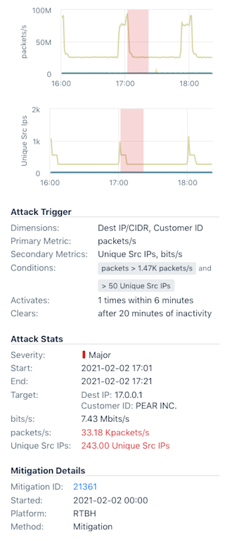
Kentik DDoS detection leverages network analytics and insights to deliver a detailed picture of your traffic, serving to identify and mitigate DDoS attacks in real time. This service protects organizations’ networks and ensures business continuity.

We’ve made a number of improvements to v4 DDoS detection and policies, see for yourself:


  • The mitigation list in v4 now shows all mitigations, regardless of whether they were triggered by v3 or v4 policies.
  • Mitigation list now includes the mitigation ID.
  • Alerts and mitigations are now cross-referenced. Alert summaries and details show any related mitigations and vice versa.


  • Configured thresholds are now displayed immediately in the policy configuration. Previously, thresholds were displayed only after the graph finished loading.
  • Thresholds must now be configured in order (i.e. “critical” must have higher threshold values than “major”).
  • Threshold lines on the graph now use colors with more contrast to make them easier to distinguish.
  • General cleanup and bug fixes in policy configuration, including IP exclusions
  • DDoS alert log is now searchable by multiple dimensions, including full or partial key values.


Avatar of authorJoe Reves
ImprovementInsights & Alerting
4 years ago

Insights: February 2021 Update

Insights are a unique feature provided by Kentik. They are autonomous notices that tell you about interesting or anomalous behaviors. Insights can be any fact that is relevant to the traffic at which you are looking. Insights help you quickly recognize where there might be a problem that requires your attention.
This February 2021, we're making Kentik Insights even more powerful.


New Comparison Insights

We are releasing a number of new comparison insights for Cloud, Edge, and Service Provider dimensions. These have been introduced in conjunction with the comparison threshold improvements (explained below). Please also see the Knowledge Base documentation.

Edge Traffic Comparison

InsightSummary
Through Destination ASN ComparisonWeek-over-week changes to the volume and/or ranking of the top 10 destination ASNs of the traffic through the edge of your infrastructure.
Through Source ASN ComparisonWeek-over-week changes to the volume and/or ranking of the top 10 source ASNs of the traffic through the edge of your infrastructure.

Cloud Traffic Comparison

InsightSummary
Outbound Cloud Service ComparisonWeek-over-week changes to the volume and/or ranking of the top 10 cloud service traffic outbound from your onprem infrastructure.
Inbound Cloud Service ComparisonWeek-over-week changes to the volume and/or ranking of the top 10 cloud service traffic inbound to your onprem infrastructure.
Multi-Cloud ComparisonWeek-over-week changes to the volume and/or ranking of the top 10 cloud provider traffic to and from your cloud infrastructure.
AWS Region to On-Prem ComparisonWeek-over-week changes to the volume and/or ranking of the top 10 AWS Region traffic inbound to your onprem infrastructure.
Inbound AWS Region ComparisonWeek-over-week changes to the volume and/or ranking of the top 10 AWS Region traffic inbound to your AWS infrastructure.
On-Prem to AWS Region ComparisonWeek-over-week changes to the volume and/or ranking of the top 10 AWS Region traffic outbound to your onprem infrastructure.
Outbound AWS Region ComparisonWeek-over-week changes to the volume and/or ranking of the top 10 AWS Region traffic outbound to your AWS infrastructure.
Hybrid Cloud ComparisonWeek-over-week changes to the volume and/or ranking of the top 10 AWS Region and AWS Subnet traffic outbound to your AWS infrastructure.
Internal AWS Region to Region ComparisonWeek-over-week changes to the volume and/or ranking of the top 10 AWS Region Pairs traffic outbound to your AWS infrastructure.
Hybrid Cloud Application ComparisonWeek-over-week changes to the volume and/or ranking of the top 10 application traffic to and from your onprem infrastructure.

Service Provider Analytics Traffic Comparison

InsightSummary
OTT Type ComparisonWeek-over-week changes to the volume and/or ranking of the top 10 OTT service category (Video, Gaming...) traffic entering your network.
OTT Service ComparisonWeek-over-week changes to the volume and/or ranking of the top 10 OTT service traffic entering your network.
Avatar of authorJoe Reves
ImprovementSynthetics
4 years ago

Synthetic Monitoring: the February 2021 update

With February 2021 comes another heavy load of new Synthetic Monitoring feature additions: Synthetics Dashboard Widgets, more functionality for Mesh tests, we're now surfacing related Network Flow data within Synthetic test results, as well as many more general point improvements. See for yourself.


Dashboard Widgets and My Kentik Portal Support

Kentik customers now have the option of adding synthetics test results as widgets to their Kentik dashboards and then sharing those widgets with their customers (tenants) via My Kentik Portal. Custom dashboards also let you visualize real traffic charts alongside synthetic test results to help you easily correlate test failures with changes in real traffic patterns.

  • Editing any existing dashboard will show users an option to add “Synthetic Test View.”
  • Clicking Add will show a modal that allows users to select a synthetic test from the list of tests configured in the account.
  • If the selected test happens to be a mesh test, the user has the option of choosing to have the widget either show a mesh or a table of results.

High Density Meshes and Mesh Improvements

The mesh tests are a very popular feature and we continue to respond to the most common UX enhancement requests. We’ve made the following improvements:

  • For very large meshes, we’ve added dynamic horizontal and vertical scrollbars when the mesh gets beyond a certain size.
  • For “Network Performance Meshes” shown in the Synthetics Performance Dashboard, a label has been added to clearly indicate the 15-minute range. Clicking the link propagates the 15-minute time range so that the test results page shows the same results as the performance dashboard.
  • The “Customize” button has been renamed to “Show/Hide” for clarity
  • We increased the string length for labels on the left and top edges of the meshes that represented sites to allow the strings to be longer and wrap across multiple lines so as to let users determine which paths/routes are failing with a quick glance of the mesh.
  • Hovering over the individual cells of a mesh would show location information as city, state, country, which is not easily actionable when testing between public cloud regions or private sites. This is now enhanced with both pieces of information.

  • The Cloud Performance preset meshes are well-received. We improved the UX around parsing their information as well as customization:
    • We added the ability to easily clone them (like the SaaS applications), which allows customers to customize them to make a "yybrid-cloud" mesh out of it for their own specific network performance needs.
    • We also show cloud regions in addition to geo (city/state) information in the labels to the left and the top.

Flow Data in Mesh Test Results

Showing real traffic time-series charts alongside synthetics metrics in the test details is an important feature, but this wasn’t possible to do for site-to-site tests (like agent-to-agent tests or mesh tests) because there was no IP to query based on. We solved this by leveraging the new site-IP configuration that was added to the device configuration. If a site-IP is present it will be used to build the traffic chart and allow the user to jump into Data Explorer to slice and dice the data further.

General Improvements

Several general improvements to the UX have been made in response to customer feedback:

  • The workflow to find a failing sub-test’s details (the time-series charts) is simplified by making the agent dots on the map clickable. Clicking them now takes you to the test details:

  • Defining and assigning a notification channel in the test creation screen is much more intuitive than it was before:

  • It wasn’t clear to users that it takes a while (up to a day) for IP changes to reflect. We added a tooltip for this:

  • The point where the day changed on the test timeline was not clear — this is improved visually. Also, the date format shown in the selector now matches the format of the date shown on the timeline:

  • The agent version for customer’s private agents is now visible to them. Also, checking a customer’s private agents’ IPs and versions is simplified — the agents’ information is readily available in the table:

  • Paused tests now show in historical data.
  • Test results legend previously said “ICMP could be blocked.” This has been generalized, as the test could be TCP or UDP.

Avatar of authorSunil Kodiyan
ImprovementSyntheticsInsights & AlertingDDoS
4 years ago

February 2021 feature update summary

Synthetics

Kentik’s product and engineering teams continued rapid iteration on Kentik Synthetics. The mesh test display has been greatly enhanced to handle large meshes, and synthetics widgets are now available for dashboards and My Kentik Portal. Flow-based traffic data has also been added to mesh test results. This builds on Kentik’s unique combination of synthetics and real traffic information to help our customers easily choose and set up the right tests.

New Insights

We’ve also added a number of new traffic comparison insights looking for traffic volume changes, changes in volume for cloud services and regions, and changes in OTT dynamics.

Alerting, DDoS & Mitigation

On the DDoS front, we’ve delivered a number of improvements requested by customers. Some are focused on better visibility into mitigation actions and others on usability improvements for policy configuration and alert history.

Avatar of authorJosh Jensen