kentik Product Updates logo
Back to Homepage Subscribe to Updates

Product Updates

Latest features, improvements, and product updates on Kentik's Network Observability platform.

Labels

  • All Posts
  • Improvement
  • Hybrid Cloud
  • Core
  • Service Provider
  • UI/UX
  • Synthetics
  • Insights & Alerting
  • DDoS
  • New feature
  • BGP Monitoring
  • MyKentik Portal
  • Agents & Binaries
  • Kentik Map
  • API
  • BETA
  • Flow
  • SNMP
  • NMS
  • AI

Jump to Month

  • April 2025
  • March 2025
  • February 2025
  • January 2025
  • December 2024
  • November 2024
  • October 2024
  • August 2024
  • July 2024
  • June 2024
  • May 2024
  • April 2024
  • March 2024
  • February 2024
  • January 2024
  • December 2023
  • November 2023
  • October 2023
  • September 2023
  • August 2023
  • July 2023
  • June 2023
  • May 2023
  • April 2023
  • March 2023
  • February 2023
  • January 2023
  • December 2022
  • November 2022
  • October 2022
  • September 2022
  • August 2022
  • July 2022
  • June 2022
  • May 2022
  • April 2022
  • March 2022
  • February 2022
  • December 2021
  • November 2021
  • October 2021
  • September 2021
  • July 2021
  • June 2021
  • May 2021
  • March 2021
  • February 2021
  • January 2021
  • December 2020
  • October 2020
  • September 2020
  • June 2020
  • February 2020
  • August 2019
  • June 2019
  • April 2019
  • March 2019
  • February 2019
  • January 2019
  • December 2018
  • November 2018
  • September 2018
  • August 2018
  • June 2018
  • May 2018
  • April 2018
  • March 2018
  • February 2018
  • January 2018
  • December 2017
  • November 2017
  • October 2017
  • July 2017
  • June 2017
  • May 2017
  • April 2017
  • March 2017
  • February 2017
  • January 2017
  • December 2016
  • November 2016
  • October 2016
  • April 2016
ImprovementCoreInsights & Alerting
7 years ago

December 2017 Update

December 2017 comes with a heavy delivery of new features, this month we're adding:

  • the Network Classification concept and dimensions (tldr: what's in your network, what's not)
  • additional Interface Classification connectivity types
  • Heatmap visualizations
  • New Host Metrics
  • A brand new Alerting Scoreboard
  • IPv6 compatibility for Radware mitigations

Network Classification

We are constantly looking for ways to make Kentik Detect easier to use, especially for users that aren’t highly network savvy. One such improvement is Network Classification, which enables the following capabilities for our users:

  • Network Directionality: Group traffic based on the direction from which it enters the network and to which it leaves.
  • Host Directionality: Group host traffic captured by kprobe based on the direction it is flowing.

Network Classification Dimensions

The capabilities listed above are supported by four new dimensions that can be applied to each flow:

  • Traffic Origination: This dimension indicates whether the source for a given flow is inside or outside of your network.
  • Traffic Termination: This dimension indicates whether the destination for a given flow record is inside or outside of the network.
  • Host Direction: When the flow record has been generated on a host, this dimension indicates whether the direction of traffic is into or out of that host.
  • Traffic Profile: Derived from Traffic Origination and Traffic Termination, this dimension categorizes traffic into one of the following directionalities, which are illustrated in the graphic below:
    – Through: Traffic coming from outside the network and terminating outside the network.
    – Ingress: Traffic coming from outside the network and terminating inside the network.
    – Internal: Traffic originating and terminating inside the network.
    – Egress: Traffic coming from inside the network and terminating outside the network.

NC-Traffic_profile-674w.png

The dimensions described above are available throughout Kentik Detect as:

  • Group-by Dimensions
  • Filter match criteria
  • Alert keys (dimensions of an Alert Policy)
  • Alert filter match criteria

Network Directionality Use Case

One interesting use case involves using Network Directionality to investigate spikes in traffic. For example, in the left graph below from the Kentik portal’s Data Explorer, we can see a big spike in flows to a customer called Pear, Inc.

Network_directionality-804w.png

In the corresponding Data Explorer table (below the graph; not shown), we can dig deeper into the data by clicking the Action menu at the right of the row for Pear, Inc. We choose Show By to open the Show By Dimensions dialog, then choose one of our new Network Classification dimensions, Traffic Origination (listed under Source). After closing the dialog by clicking the Show By Selected Dimensions button, we re-run the query. We can now see (right graph) that the spike is made up of traffic that originated outside of our network. If we wanted to continue digging further, we would use Show By again, this time looking at source ASN or IP address.

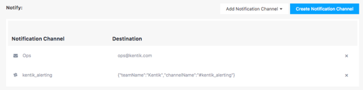
Note that these same dimensions can also be used in Alerting to monitor traffic that comes from outside the network separately from traffic that is internal to the network. For more information on creating alerts, check out the Policy Alerts Overview in our Knowledge Base.

Host Directionality Use Case

Another use case for Network Classification is specific to host traffic captured by kprobe (Kentik’s software host agent). Since most hosts have only a single interface through which traffic can pass, kprobe captures both inbound and outbound traffic. Until now, it was difficult for a Kentik Detect user to separate which traffic was coming in and which traffic was leaving. But now it’s possible to distinguish one from the other. As shown in the graph, with Host Direction used as the group-by dimension you can now see separately the flows in (black) and out (blue) of a host.

Host_direction-816w.png

Configuring Network Classification

Admin_sidebar-187w.png
To benefit from the new Network Classification feature you must first enable Kentik Detect to determine what is inside and what is outside of your network. The configuration is pretty simple, assuming that you are an Admin user. Start by navigating to Admin » Network Classification, then fill in the following two fields:

  • Internal IPs: Enter a list of the IP CIDR blocks used inside the network. By default, the RFC1918 IP Space is included with the user defined list; this can be changed with the checkbox below the field.
  • Internal ASNs: Enter a list of ASNs used inside the network. By default, the Private ASN range is included with the user defined list; this can be changed with the checkbox below the field.

Once the fields are filled and you’ve clicked the Save button, you’re ready to begin using Network Classification.

New Types for Interface Classification

IC_types-265w.png
Interface Classification — which debuted in our July Product Update — shows the types of interfaces through which your traffic enters and leaves your network so that you can optimize your network for cost and performance. As part of our ongoing enhancement of that feature, we just expanded the list of Connectivity Types, which are used to classify interfaces by their role in the overall network. The new types are:

  • Datacenter Interconnect
  • Aggregation Interconnect

If your network includes these types of interconnects, after you run Interface Classification you can now specify these interface types when you query, build dashboards, monitor with alerts, and more. For more information on using this feature, head to our Knowledge Base for the article on Interface Classification.

HeatMaps for Countries and Sites

One feature that’s been among the most common requests from customers is the ability to visualize network data on a map. We just added mapping capabilities in the form of a new Geo Heat Map view type (accessed via a drop down view type menu like you’ll find at the upper right of the display area in Data Explorer). This new type enables a couple of map visualizations that we think you’ll find quite useful:

  • Country Heatmap
  • Site Heatmap

Country Heatmap

A country heatmap shows the source or destination of traffic by country on a global map. This feature uses the GeoIP data that we add, based on Source and Destination IP address, to each flow record in the Kentik Data Engine. The visualization shows one direction (source or destination) at a time of traffic using Country geo-information. A color key indicates the volume of traffic for each country.

To generate a country heatmap in Data Explorer, first set the group-by dimension to either source or destination country. Then change the visualization type in the drop down in the upper right hand corner to Geo HeatMap. The resulting graph should look similar to the map below.

Heatmap_country-800w.png

Site Heatmap

A site heatmap shows the total traffic, inbound plus outbound, by each site in your network. The larger the circle on the map, the more traffic at that site. For greater detail, hover over a circle to open a pop-up giving the site’s coordinates and the total amount of traffic.

Before you can use this feature you have to provide a street address for each of your sites, which you can do with the Edit Site dialog in Admin » Sites (you must be an Admin user; see Editing a Site in our Knowledge Base article) or with our Site API.

Once the site addresses have been specified, you can build a query in the Data Explorer using the group-by dimension Site (FULL) and the view type Geo HeatMap. The resulting visualization should look something like the map below.

Heatmap_site-800w.png

Expanded Host Metrics

The savvy Kentik user is already aware of our software host agent, kprobe, which runs on a server and provides host performance metrics. For those not familiar with this functionality, check out our blog post on one intriguing application for this, which is using kprobe to monitor DNS infrastructure.

This month we’ve expanded kprobe functionality by adding the following metrics:

  • Repeated Retransmits: The number of TCP packets that have been retransmitted more than once, likely due to packet loss along the path from sender to receiver.
  • Zero-Window: The number of times the TCP receive window has been set to zero, indicating that the receiver cannot keep up with the flow of data from the sender.
  • Receive Window Size: The size of the TCP receive window reported by the receiving host.
  • Connection ID: The TCP or UDP Connection ID for the session that the reported flow belongs to.

To start leveraging the expanded metrics, install the latest version of kprobe (see kprobe download and install in our Knowledge Base).

Scoreboard for Alerting

Anomaly detection, alerting, and mitigation are core features of Kentik Detect, and we continue to devote a lot of effort toward improving workflow and usability. Recent changes to the Alerting section make this powerful functionality easier to set up and use. The first place you go when you click Alerting in the Kentik Detect navbar is the Active Alerts page, which we’ve just enhanced with an Alerting scoreboard. So it’s now easier to see at a glance the things that most need your attention.

Alerting_summary-825w.png

The top part of the scoreboard is a set of summary tiles (shown above), one for each of three types of events:

  • Mitigations: Shows a count of how many alerts are currently being mitigated, either automatically or manually. A button (+ sign) for manual mitigation is also included. The background color of the tile varies depending on the count:
    – Grey: No mitigations currently in progress.
    – Purple: 1 or more mitigations currently in progress.
  • Alarms: Shows a count of alerts that are in ALARM state, meaning that the conditions defined in the alert policy have been met and notifications have been triggered. A count of the alarms at each severity is also included. The background color of the tile varies depending on the severity (minor, major, critical) of the most severe alarm:
    – Grey: No alarms currently active
    – Dark Red: The highest severity level is Critical.
    – Red: The highest severity level is Major.
    – Orange:  The highest severity level is Minor.
  • Acknowledgements: Shows a count of alerts that are in ACK_REQ state, meaning that the conditions that resulted in an alarm are no longer present, but an acknowledgement is required from a user in your organization before the alert is removed from the active list. The background color of the tile varies depending on the count:
    – Grey: No acknowledgements pending.
    – Blue: 1 or more acknowledgements pending.

Below the summary tiles is a matrix whose rows represent either mitigations or alert policies that are in alarm. The columns represent the top values of a dimension chosen when the matrix was configured (click the gear button to edit the configuration). The matrix lets you quickly see what’s going on with the policies that are most in need of attention.

Alerting_matrix-800w.png

Key an eye on our Knowledge Base for coming topics related to the Alerting Scoreboard.

IPv6 Support for Radware Mitigation

Kentik Detect includes the ability to integrate with mitigation systems from third parties including Radware. Until recently, you could only define a Radware Mitigation Platform using an IPv4 address. We now have the ability to make an API call to a Radware appliance using either an IPv4 or an IPv6 address.

Avatar of authorGreg Villain
ImprovementCoreInsights & AlertingDDoSNew feature
7 years ago

November 2017 Update

Guided Mode Dashboards

While Data Explorer is oriented toward ad-hoc investigation, Dashboards rely on pre-configured views to provide at-a-glance presentation of status. Guided Mode adds speed and flexibility by enabling users to quickly change — without setting complex query options — the value of the dimension that one or more panels on a given dashboard is intended to track. Guided mode dashboards allow power users to build dashboards that other users can use without having to become experts on the powerful filtering capabilities of Kentik Detect.

Guided_moded_dimension-400w.png

Once a guided mode dashboard is set up, users of that dashboard are prompted to fill in (or select from a drop-down menu) the value of the guided mode dimension. For example, if your dashboard presents different views of traffic from a given country, you could set the guided mode dimension to source country and configure a set of panels that all change when the end-user chooses a different country.

SecOps_dash-400w.png

Another example is the preset dashboard called SecOps – IP Investigation, which Kentik has changed to guided mode. Instead of being locked to a specific IP range that was chosen when the dashboard was created, the dashboard’s panels now follow the IP range that users are asked to specify when they go to the dashboard, and which they can change at any time.

For more information on Guided Mode Dashboards, check our Dashboards article in the Knowledge Base.

Single Sign-On (SSO)

How do you make it more convenient to maintain user security without having to constantly enter authentication credentials? Kentik’s answer is to enable single sign-on (SSO) for the Kentik Detect portal. Our new SSO implementation is compliant with standard SAML2 transport and includes encrypted SAML assertions, automated user provisioning, and IdP-enforced role-based user-privileges. It has been successfully tested with the following identity providers:

SSO-Logos-810w.png

For more information on the benefits of our SSO feature and how to get started, check out our SSO blog post or Knowledge Base article.

Data Explorer Enhancements

As one of the most-used sections of the Kentik Detect portal, Data Explorer is constantly assessed and refined, so there have been quite a few enhancements, more than we can report on in full. Among the highlights that we’ll cover below are new dimensions for threat feed and CDN attribution, a new visualization type (Time Series 100% Stacked Graph), and IPv6 support for Ultimate Exit.

CDN Attribution & Threat Feed

We’ve added a few new dimensions that can be used as either source or destination dimensions for queries, filters, alerts and more. The first is CDN, which maps CDN names to IP addresses. This dimension is only available to customers who are contributing IP and DNS name mappings by running our custom kprobe agent on their DNS servers. To learn more, and see how to enable it for your account, check out our CDN Attribution article in the Kentik Knowledge Base.

CDN_attribution-816w.png

Two other new dimensions help you determine if you are dealing with traffic from a suspect IP address. The diagram below shows how this system works. Our friends at SpamHaus maintain information on IP reputation, which we obtain and keep in a database that we update daily. As each flow record is ingested into the Kentik Data Engine (KDE), we compare their source and destination IP addresses with the IPs in the threat database. If anything matches, we mark it in the flow record using new KDE columns.

Threat_diagram-811w.png

Once the BotNet CC and Threat List Host dimensions are in the KDE they can be used for group-by and filtering. As shown below, that enables users to query for hosts in their network that are communicating with known BotNet Command and Control (CC) servers or other known compromised hosts.

Bot_feed-800w.png


Keep an eye on the Kentik blog in the coming weeks for a post with more information on how these new dimensions work and what you can do with them.

Time Series 100% Stacked Graph

Kentik Detect already gives you lots of options for visualizing your data, and we’ve now added yet another. The Time Series 100% Stacked Graph shows each matching key (unique combination of dimension values) on the graph as a percentage of the total traffic returned from the query.

100_percent_graph-695w.png


IPv6 for Ultimate Exit

Kentik Detect’s Ultimate Exit capability enhances every flow record ingested into KDE with fields representing the Device (router), Site (Pop,) and Interface where the underlying flow will exit to an adjacent network. Until now, Ultimate Exit used to work only for IPv4 traffic (IPv6 traffic was ignored), but now both IPv4 and IPv6 traffic are included in these queries. For more details on how to use this feature, check out our Ultimate Exit blog post.

DDoS and Alerting improvements

Integrated anomaly detection, alerting, and mitigation is a key feature set for Kentik Detect, and we continue to devote a lot of effort toward improved workflow and usability. Our recent changes to the Alerting section make an already powerful functionality easier for customers to set up and use.

Alert Policy Creation

Alert policies are at the heart of our alerting system, defining conditions that will result in a notification and possibly trigger a mitigation. The power and flexibility of our system brings with it some inherent complexity, but we’ve nonetheless been able to greatly improve the policy creation workflow. The process is now structured as a set of tabs that are each labeled with a caution symbol until all required information is provided, at which point the label switches to a check mark. The UI also now provides a better explanation of how the value of each field impacts the behavior of the overall alert.

Alert_policy_tabs-818w.png

Role-based Alerting Control

Kentik Detect supports three levels of users (Member, Admin, and Super-Admin), each with different permissions. We’ve now implemented this multi-level approach in our Alerting system to differentiate the tasks that can be performed by different-level users:

  • Member users are restricted to clearing alarms and stopping mitigations. Members cannot create or modify alert policies, but to facilitate troubleshooting they are able to view policies.
  • Admin and Super-Admin users have complete control over all aspects of alerting setup and operation.

Manual Mitigations

Previously a mitigation could only be triggered based on an active alert. We’ve added the ability to trigger a mitigation manually, even without an active alert. It’s important to note that a mitigation that’s been triggered manually won’t end on its own; it must also be ended manually.

Manual_mitigation-400w.png

To trigger a manual mitigation, click Alerting on the main portal navbar, then choose Manual Mitigation from the sidebar at left. In the resulting Add Manual Mitigation dialog, fill in the following fields:

  • The Mitigation Platform and Method (must be predefined in the Platforms and Methods pages of the portal’s alerting section)
  • The IP/CIDR to mitigate
  • Comment (optional)

The mitigation starts immediately once you click the Add Manual Mitigation button. Because manual mitigation is intended to be applied as a one-off, the settings in the dialog are not saved for later reuse. Instead the mitigation exists only until it is manually ended from the Active page of the alerting section.

Enhanced RTBH Mitigation

Another alerting enhancement relates to our built-in Remote Trigger Black Hole mitigation. We’ve added the ability for customers to set the Local Preference (the BGP LOCAL_PREF attribute) on routes that are advertised for RTBH, so that you can ensure that the blackhole route is the preferred route for forwarding traffic.

Local_pref-300w.png

Local Preference is configured in the Add Mitigation Method or Edit Mitigation Method dialog, which you reach from the Methods page of the Alerting section. Click the Add button to add a new method, or click on an existing method to edit it, then scroll down to the Local Preference field towards the bottom of the dialog.

Avatar of authorGreg Villain
ImprovementNew feature
7 years ago

October 2017 Update

In October 2017, we introduce a whole new concept: Interface Classification, as well as a ton of additions to the product, read on!


V3 UI with Dark Theme

Use_dark_theme-180w.png

To any regular user of Kentik Detect the most obvious update is probably our new User Interface (UI), which has a cleaner, more modern layout. Users can now choose between our standard white-background theme or a new dark theme with a darker background. The dark theme is designed to minimize eye fatigue for customers who spend many hours a day looking at large screens. To use the dark theme, hover over your username at the right of the portal navbar, then choose Use Dark Theme from the drop-down menu.

Dark_mode-820w.png

BiDirectional Charting

Bidirectional_charting_switch-310w.png

Have you ever wanted to plot two data series on the same graph? Our new Bi-Directional Charting feature (which replaces V2’s Multi-Data-Series functionality) allows the display of two graphs in one, with the second graph plotted against the negative Y axis. To use this feature, enable it under Advanced Options in the Query pane of the Data Explorer sidebar. You can use this feature either for inversion or for a secondary metric.

By default, turning on Bi-Directional Charting results in inversion, in which the original query (the dimensions and filters you specify) is plotted on the positive Y axis above and the inverse of that query is plotted on the negative Y axis below. The tables corresponding to each graph appear in the Original Query and Opposite Query tabs below the graph.

Opposite_query-820w.png
Secondary_metric_switch-310w.png

To plot a secondary metric instead of an inverse query, choose a metric from the drop-down Secondary Metric selector, which is also in the Advanced Options section. After clicking the Run Query button to update the display, both graphs will use your original dimensions and filters, but the positive axis will display results measured in the primary metric while the negative axis will show results in the secondary metric. A simple use case would be to simultaneously see bits/second and packets/second.


Secondary_metric_graph-810w.png

Interface Management

In the Admin section of the V3 portal we’ve created a dedicated screen for Interface Management (Admin » Interfaces) which used to be part of Device Management. At top left you choose the device whose interfaces you want to see in the Interface List below, where you’ll find information about each of the device’s interfaces, including description, boundary ASNs, capacity, interface classification, and more.

Interface_list-824w.png

Among the data points you’ll find on the new Interface Management page is our new Boundary ASNs indicator. This cool new feature uses the flow data collected by Kentik Detect to determine the ASNs your infrastructure connects to directly via your edge interfaces (Network Boundary = External). In the example above you’ll see a “View 2 ASNs” button in the Boundary ASNs column; if you were to click on that button in the example shown, a list would pop up showing the ASNs detected on the interface as well the interface’s traffic to each listed ASN as a percent of the total traffic to that ASN from the entire device.

Interface Classification

Classified_interfaces-277w.png

Also new to the V3 portal are a number of improvements to the Interface Classification Rules Editor (Admin » Interface Classification; see Interface Classification in the Kentik Knowledge Base). On the Interface Classification page, the Classified Devices Pane at right displays all of the devices your organization has registered in the portal and tells you how many interfaces on each device are classified. If your percent of classified interfaces is anything less than 100, you’ll see an Unclassified Interfaces button that opens the Unclassified Interfaces dialog, where you’ll find information about the interfaces that aren’t being classified by your classification rules.

Speaking of rules, the UI for the Add Rule and Edit Rule dialogs has been improved as well. After creating a rule, you can click the Test Rule button to apply the rule on a test basis and see a list showing how many of interfaces remain unclassified.

For a fuller explanation on using Interface Classification, check out our Interface Classification blog post.

New Version Notification

Our development teams here at Kentik are continually improving Kentik Detect by pushing out new features and bug fixes. We now include a popup notification to users whenever an update is available since the browser was refreshed.

Update_available-464w.png


Avatar of authorGreg Villain
CoreNew feature
7 years ago

NEW: Interface Classification

Much of our development effort in July 2017 was directed toward under-the-hood improvements that will make it faster for us to innovate in response to customer needs and feedback (more on this in coming months). At the same time, we haven’t lost our focus on practical ways to make daily operations easier. With that in mind, we’ve added a cool new feature called Interface Classification (IC). By allowing you to more quickly and easily understand the types of interfaces your traffic uses to enter and leave the network, IC gives you the ability to optimize your network for cost and performance.


Network boundary attributes

Interface Classification relies on a couple of different types of attributes derived from network data, one category of which is “network boundary.” By classifying the interfaces as internal or external, we can compare the source and destination of the traffic to see if both are fully within your network or crossed a network boundary (came from or went to a different AS). This distinction allows Kentik Detect to avoid counting a given flow multiple times as it passes through the network. And it gives technical decision makers the ability to see how much traffic is coming in and out of their network versus how much of it is contained within the network.

Network_Boundary-811w.png

Connectivity type attributes

Another category of IC attribute is connectivity type, in which interfaces are labeled by their connectivity type, such as transit, ix, paid peering, etc. Identifying the type of connectivity used by traffic through a given interface gives you a way to determine costs and optimize pricing for each category of traffic.

Connectivity_type-824w.png

Defining interface classifications

Now that we understand classification attributes, how is IC enabled in Kentik Detect? The goal is to use the attributes as dimensions and filters in queries and visualizations. To do so, the attributes must be added to flow records as they are ingested into the Kentik Data Engine (KDE). The magic starts on the Interface Classification page of the portal (Admin » Interface Classification), where you create rules that classify interfaces by evaluating patterns in the interface description or IP address.

To create a new rule, click on the green Add Rule button. The “If” section tells the rules engine what to look for. In the “Then” section, you can define the Connectivity Type and optionally the Network Boundary. By default, the Network Boundary is automatically determined by the Connectivity Type (more on this in the next section).

Add_rule-800w.png

Once you’ve created and saved a rule, the Evaluate Rule button (upper right) initiates evaluation of your Kentik-registered interfaces against all of your currently active rules. The number and percentage of interfaces that are matched is shown in the sidebar. If you update your IP addresses or interface descriptions, you can click on the Evaluate Rules button to re-run the classification rules. This makes it exceptionally efficient to classify all of your interfaces.

IC_main-800.png

Setting up network boundaries

In the operation described above the classification of network boundary (internal or external to the network) was automatic, and it relied on Kentik Detect’s preset definition of the network boundary associated with each connectivity type. However, using the Configure Network Boundaries modal (button at top of IC page), you can set your own correlation between a connectivity type (backbone, customer, host, etc.) and network boundary.

Boundary_modal-802w.png

The description above just skims the surface of Interface Classification. Look to the Kentik blog in coming months for deeper insights into how IC works and what you can do with it.

Avatar of authorGreg Villain
ImprovementCoreNew feature
7 years ago

June 2017 Update

Email activation workflows

When first creating your account, and also when changing your password, you’ll now be sent an email to which you’ll be required to respond in order to complete the remaining steps in the process. This change applies in the following situations:

  • You sign up on kentik.com.
  • An Admin creates an account for you.
  • You change your account password via your User Profile page in the Kentik Portal.

TOTP 2-factor authentication

Password_reset-500w.png

The Kentik Detect portal now allows users to add 2-factor authentication to their account. The flavor we use is called Time-based One Time Password, aka TOTP. It works with any mobile app allowing you to register TOTP tokens, including the following, which can be found on Google Play and the Apple app store.

  • Duo Mobile
  • Google Authenticator
  • Authy

Enter_token-500w.png

To enable TOTP in the Kentik Detect portal, open your User Profile page by clicking on your username at the right of the navbar. You will now see a ‘security’ section in the User Information pane at right.

Click the Register for TOTP button and follow the instructions (you’ll be presented with a QR code to enroll your mobile device). Once you’re enrolled, at each login you’ll be prompted for a TOTP token after entering your login/password.

Disable_TOTP-201w.png

If for some reason you lose your token or change your device, please contact an Admin user within your organization. This user can disable TOTP for your account by going to Admin » Users to access the Edit User page for your account, then clicking the Disable TOTP button. At this point you’ll be able to log back in and re-enable TOTP with your new device.

Expanded Dimensions and Metrics

Several recent changes have expanded the dimensions and metrics available for use in your queries.

Enhanced granularity on wider queries

Uniques_list-193w.png

Depending on the time-range of a Kentik Detect query, the individual one-minute slices stored in the KDE (Kentik backend) may be aggregated into wider aggregation steps for returned results (for more explanation, see Time Rounding in the Kentik KB). For queries whose time-range was 24 hours or more, each aggregation step used to represent 20 minutes. We’ve now halved that to 10 minutes, doubling the resolution of results from these longer queries.

Advanced computation of unique metrics

The options available for metrics include more than a dozen that count unique instances. Until recently we computed these over a single time-slice for a single device, but we announced back in May that for Unique Src/Dst IPs we were now computing across the union of all devices. From that first step toward enhanced accuracy we’ve now extended these improvements in two ways:

  • We now count not only for the union of all devices, but also for the union of all time-slices across the entire time range.
  • We apply this new computational method not only to counting unique IPs, but to all of our “Unique” metrics.

The ability to look across time-ranges and devices all combined together is now enabled in our portal UI with a new Total option in the drop down Display and Sort By list in the Advanced Options section of the Query pane (Data Explorer sidebar). Without using Total, the returned value would represent all devices but only in the time-slice with the greatest number of unique instances of the counted metric. Using Total, you’ll instead get the total number of “uniques” across all devices for the entire width of the query, which is a much more realistic method for counting uniques across devices and time.

New Total option

Display_and_sort-398w.png

While the new Total capability is particularly interesting for unique counts, it will also come in handy to compute things like total bytes, packets, flows, and retransmits that could previously be displayed and sorted by Max, Avg, or p95th for one time-slice. For non-timeseries display types you can now specify total over the entire time-range.

New metric: Unique Dst/Src Port

With the addition of this latest metric you can now look at variations in the number of unique source and destination ports over multiple devices. This should be particularly useful for the purpose of security assessment, where seeing a significant change in the number of source/destination ports could be a warning sign of scans or attacks.

Added Alert Notifications

We continue to expand the range of options available for you to receive notifications from our anomaly detection and alerting system.

Alert_notification_options-624w.png

PagerDuty integration

PagerDuty is the latest add to the list of our alert notification integrations. With this integration, Kentik alerts can now create incidents within PagerDuty. PagerDuty is a widely adopted and nicely straightforward Incident Resolution Platform as a service (it’s the one we actually use at Kentik). If you haven’t tried it before, check it out.

Create_notification-500w.png

Each of your PagerDuty services can be configured in the Kentik Detect portal as a separate notification channel and assigned to one or more alert policies, which allows you to map notifications for various kinds of conditions to the relevant network team. For example, you can have capacity-related alerts trigger a PagerDuty incident on a service that’s handled by your network provisioning team, while security incidents can trigger notifications to a different service that’s owned by your network security team. Check out our knowledge base entry on PagerDuty integration for step-by-step configuration details.

Alert notification documentation

Speaking of our KB, the entries on alert notification channels have been updated with additional information to make it easier to set up channels that integrate with external systems and to assign channels to alerts. The Alert Notifications section should be your first destination for guidance on configuring notification channels. As a reminder, you can currently integrate Kentik Detect alert notifications with Syslog, JSON Webhooks, Slack notifications and, now, PagerDuty. As always, email notifications are available as well.

Avatar of authorGreg Villain
ImprovementCoreInsights & Alerting
7 years ago

May 2017 Update

nProbe Hosts and NPM v2

nProbe is agent software from ntop that is used to get traffic data from hosts to Kentik Detect. Kentik’s integration with nProbe has undergone significant improvement with newer versions (7.5 or higher). We’ve summarized some key points about the upgrades below; you can also learn more about the changes in the following Knowledge Base topics:

  • Installing and running nProbe on a host: Host Configuration.
  • Newly available metrics and dimensions: Host Metrics and Dimensions.

Selecting Host Devices

nProbe hosts are selected like any other devices in the device selector in the Devices pane of the Data Explorer (shown at right). nProbe hosts of v7.5 or higher are represented with the device type icon that is labeled “DNS WWW.”

New Metrics for NPM

nProbe-based deployments can now query on new Network Performance Monitoring (NPM) metrics (listed at right) in addition to the traditional metrics available from non-host devices (e.g. routers and switches).

Native Data Format

nProbe now communicates natively with the Kentik Detect platform, which means that there’s no need to use the Kentik Proxy Agent (chfagent) for hosts, even in private IP deployments. nProbe now sends traffic data to Kentik Detect using kFlow, Kentik’s own enriched and encrypted flow format.

New Host-specific Dimensions

Users running the new nProbe version are now able to query on host-based, application-level group-by dimensions. The initial set of new dimensions, which are related to DNS and WWW, are listed at right. These dimensions are available in the Group-By Dimension selector whenever any selected device is a host (see above).

Grouping by Substrings

Depending on the specific host dimensions selected to group by, a cut function for DNS/WWW dimensions will be available in the “Advanced Options” section of the Query Pane. This feature allows grouping by regex-matched substrings. In practice this means that you can dynamically pull results for metrics that are broken down by specific string patterns within those dimensions, such as TLD, domain name, specific HTTP Query arguments, or subsets of User Agent strings.

As an example, the graph and table below were generated using the DNS Query group-by dimension on an nProbe host:

DNS_query-800w.png

Using the DNS cut function, this query can be refined to group by domains, with the result shown below:

DNS_query_cut-800w.png


Access Control Lists

In our constant effort to increase security around access to your critical data, we have just added the Access Control (aka ACL) feature. Access control, which is covered in the Access Control article in our Knowledge Base, is configurable through Kentik Detect Portal at Admin » Access Control menu:

What ACLs offer is the ability to filter, by IP address or subnet, access to four different subsystems of Kentik Detect:

  • Portal: controls access via the Kentik Detect portal.
  • API: controls access via Kentik APIs.
  • Agent: controls access via the Kentik Proxy Agent.
  • Database: controls access via a PostgreSQL client.

Two options are available for each individual interface:

  • “Allow All” (default setting for Portal and Agent).
  • “Deny All except,” which enables you to whitelist individual IPs/CIDRS (default for API and Database).

Data Explorer additions

Unique Count of Source and Destination IPs

The technique for calculating unique source and destination IP counts over multiple selected devices has been updated for improved accuracy. We used to compute the #unique destination IPs for each selected device, for each 1-minute time bucket, then return the max per-device count of IPs within the specified time range. We now get a more realistic result by computing the number of unique destination IPs for the union of all selected devices, and then take the max corresponding to the specified time range.

New metric: Unique Destination next-hop ASNs

With this new metric you’ll be able to count the number of unique Next-Hop ASNs for a given device. This can be useful to track the number of peers you have on a specific Internet Exchange, as shown below.

Bi-directional Filters

We’ve noticed that when doing our own spelunking in Kentik Detect we often look up flows against a given ASN or IP/CIDR regardless of whether it’s a destination or a source. That used to require two filters, which could add up to a lot of extra work when stacking filters to narrow a query. So, as shown below, we’ve now provided a whole additional column in the Filter selector with dimensions that match source OR destination. Dimensions with this convenience include Country, ASN, AS Name, Flow Tag, IP Port, Mac Address, IP/CIDR, Interface ID, Interface Name, Interface Description and Route Prefix.

SNMPv3 Polling

We’ve added SNMPv3 to the existing SNMP v2c methods for automated polling of meta-data on your devices. SNMPv3 is a more secure iteration of SNMP and is preferable when your SNMP information will travel over the open Internet (i.e. when you are not directly peered with Kentik’s AS).

SNMPv3 adds two layers of security to the v1 and v2c model: authentication and privacy (a.k.a. encryption).

When configuring a device, you can now enable SNMPv3 by turning on the toggle.

Both can be individually enabled and configured in the SNMP section of the device page:

  • Authentication: Both MD5 and SHA methods are supported.

  • Privacy (encryption): Only 56-bit DES is supported for encryption (AES or 3DES are not currently supported).

Alerting Updates

Slack_channel-500w.png

Slack Notifications Channels

Our Alerting system is gaining output capabilities as we move to enable more seamless integration with your internal workflows. In addition to email, syslog, and JSON, we’ve now added Slack notifications to our range of available Alerting Notification Channels. Check it out at Alerting » Notification Channels, where you can now create a Slack notification channel

After you set configurations in a series of Slack web pages where you select your Slack Team and the channels to post in, this newly created Notification Channel is then available for use in the thresholds of your Alert Policies.

Notification-800w.png

The below example shows a Kentik alert notification in Slack:

Slack_alert-450w.png

Weekend-aware baselining

Baseline settings in an Alert Policy now include a “Weekend Aware” option (shown below). When active, this setting takes into account the day on which traffic will be evaluated against the baseline:

  • If evaluated over the weekend (Saturday, Sunday), only weekend days in the look-back period will be considered.
  • If evaluated over a weekday, weekend days will be discarded from the loopback.

Weekday_baseline-800w.png

This option can be a life-saver for situations like content networks, where there is a lot of traffic over the weekend and much less traffic on weekdays. Without taking the day of week into account, weekend traffic could set off false positives for alerts that track unusually high traffic.

Miscellaneous Alerting Updates

Additional improvements to Alerting:

  • Bi-directional filters (see above): available in alerting too!
  • Packet–Size: now available in Alert Policies, a both:
    – a Dimension to use for Group-By;
    – a Filter to include or exclude specific packet sizes.
  • View in Explorer: View_in_Explorer-400w.png
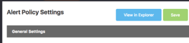
a button on Alert Policy page that allows you to look at the existing, current flow data against which you are trying to build a policy.

BGP Events Notifications

BGP_setting-300w.png

You asked for it: we’ve added a notification toggle for BGP events to the notification setting on the User Profile, which is accessible by clicking your username at the top right of the navbar.

With this setting toggled to “Yes” you will be informed via email of any BGP event on Kentik Detect’s ingest points, including all service-affecting issues. We will continue to notify about BGP-affecting maintenance windows via our usual channels.

Avatar of authorGreg Villain
ImprovementCoreInsights & Alerting
8 years ago

April 2017 Update

Ultimate Exit Release #1

Fasten your seat-belts, this one is a big deal. It’s the first release within a bigger plan for end-to-end visibility of your traffic, which is a holy grail objective of flow data reconciliation. What do we mean by “end-to-end visibility”? It means an easy way to figure out what volumes of traffic are flowing in and out of your network, from any source to any destination network.

A great example of this is assessing potential peer or transit prospects. How many times have you had to toggle between multiple spreadsheets that contain only approximations of traffic to or from various ASNs, getting bogged down in hacked, convoluted excel formulas, all in order to guess the ROI of what should be a simple decision?

What about trying to figure out how much traffic from a peer is being routed locally versus over more costly long-haul links? You need to able to figure out precisely at the site and device level — and at the interface level in the future — the traffic flowing between network entry and exit points.

It turns out that the sophistication of flow consolidation and reconciliation needed to achieve this task is beyond home-grown tools, data infrastructure, and software engineering capacities of many network engineering teams. And for good reason. It’s a hard problem.

Voila! New Exit Dimensions in Kentik Detect

Introducing two newly added destination dimensions (fanfare, please):

  • Ultimate Exit Site
  • Ultimate Exit Device

How do you use these? Let’s say you are a transit provider. You move packets from content providers to eyeball ISPs, and carry them over a costly global backbone. You want to look at the traffic you’re exchanging with one of the major content providers like Google, and see where it comes in, and where it comes out of your network.

Let’s further assume that you run a well organized network, so you indicate within your Interface description nomenclatures any interconnections with Google. This means you can easily include these interconnects with a simple filter. For example:

55-PM.png

BTW, if you know that you’re going to be looking at these often, you can also make yourself a nice Saved Filter (see below) and just apply it any time you need it.

30-AM.png

Then you can use that saved filter in any Data Explorer query you’re working on.

14-PM.png

So here’s what you want to look at, in sequence:

  • The site where the traffic enters the network.
  • The site where the traffic leaves the network.
  • The next-hop Network.
  • Which eyeball network it is terminating at, i.e. Destination AS.

Using Kentik Detect’s handy new dimensions you can now answer this question with the following query:

32-PM.png

For a useful visualization, select the Sankey display type:

ultimate_exit_sankey.png

Looking at the generated Sankey diagram (above), you can now instantly see what traffic is flowing between the entry Site and the Ultimate Exit site, and which eyeball networks are reached. What you would typically do at this point is look at where transport is the most expensive or least performant between your Entry Site and Ultimate Exit site and optimize for either of them.

In the above Sankey chart, you can see that you’re shipping a lot of traffic from Frankfurt to Marseilles. So a few questions come to mind that can be explored further in Kentik Detect:

  • Should you track Google’s ability to PNI in Marseilles and save yourself some Frankfurt→Marseilles transport costs?
  • Do you want to review your prices for transport for London→Marseilles based on how much of that capacity is consumed by your Google PNI?
  • What portion of the private links between Frankfurt and Marseilles is going to those Google PNIs, and therefore what’s the real ROI you’re getting from these links?

You can’t even start this ROI exploration when you’re stuck in spreadsheet hell. Stay tuned, because there’s a lot more coming over the next few months in this arena.

Custom Dimensions Update

Our Custom Dimension infrastructure has been upgraded, allowing us to upgrade our default provisioning rules:

  • Max Custom Dimensions per customer account: increased from 5 to 10.
  • Max characters per dimension: increased from 12 to 128.
  • Max populators: upgraded from 5000 per dimension to 10,000 overall across all dimensions (no additional per-dimension limit).

User Based Filtering [PREVIEW]

Every now and then we will preview an upcoming feature. We also believe that occasionally there is value in releasing an early/crude version of a feature-set in order to get early feedback from our users, which we can then use to quickly iterate until we arrive at the feature that users really want. In the case of User-Based Filtering (see Knowledge Base article), we are previewing here a feature that we have decided to introduce as an early release.

Kentik Detect currently supports two different user levels: Member and Admin. User-Based Filtering allows an Admin user to apply a user filter that restricts the data available to a Member user. The underlying idea is for Admins to be able to grant (very) granular rights on what specific Members are allowed to see and/or query.

Admin users can set up a user filter on the Users page (Admin » Users).

09-AM-1.png
22-AM.png

A user-based filter is composed like a filter in the Filters pane of the Data Explorer sidebar. Once a user filter is associated with a given user, these filters are systematically appended (ANDed) with any query run by that user, including:

  • Data Explorer queries via Kentik Portal UI
  • SQL queries from the SQL Query explorer or via PGSQL connections
  • API queries

One use case example is allowing only certain users to query flows from backbone routers, as shown in the following screenshot:

35-AM.png

Another example, shown below, allows certain users to query only flows for CUSTOMER interfaces on ‘Ashburn DC3’ and ‘Ashburn DC4’:

11-AM.png

As explained above, we have released the minimum amount of functionality for this feature, and hope to leverage the feedback of interested users to iterate it.

Some open questions we have for this feature include:

  • Should filtered users be made aware in the UI that they are being filtered? In the current version of this feature, the user wouldn’t know.
  • If filtered users are made aware, should we indicate a permanently locked filter setting in the Data Explorer?
  • Should we let users know they are being administratively filtered, but not indicate what the filter constraints are?
  • Should the display of filtering information be administratively configurable at the user level?
  • How do we mention or indicate user filtering in the API and SQL? For example, when a user submits a SQL query, should we return a modified version of the submitted requests with the appended filtering in its SQL form?

Please let us know your feedback on support@kentik.com. Is this a useful feature that you would like to rely on? What should the next iteration look like?

Sampling Rate

This is one for the nerdier users out there. As you may know, our ingest platform includes smart ways of re-sampling flows exported by your devices to match your contracted FPS. We’ve been improving this functionality quite a lot recently. Our goal is to resample accurately and keep the resampling-bound distortion as close to zero as possible.

In order to keep our engineering work accurate, we actually had to add Sampling Rate to our available dimensions, metrics, and filters, as shown in the images below:

Available Dimensions:

46-AM.png

Available Metrics:

00-AM.png

Available Filters:

31-AM.png

This could come in handy on your end when debugging potential flow sampling misconfigurations.

Extra Data Explorer Niceties

As we see our customer’s usage of the Data Explorer evolve we often throw in additional convenience features that we think will streamline the overall user experience. This time around, we’ve added a couple of convenience tweaks, both of which are geared towards making queries return faster by allowing users to optionally skip certain processes.

  • Disable Total: You can now disable computation of Total over a metric if you already know you aren’t interested in looking at the total value for your breakdown. This saves processing time on our mid-layer, resulting in faster return of query results.
31-AM.png
  • Disable Hostname lookups: You can also now disable Hostname lookups directly from the Data Explorer query panel, which reduces query response time because IPs won’t need to be reverse DNSed before returning the results of an IP/CIDR breakdown.

With reverse DNS enabled:

28-AM.png
25-AM.png

With reverse DNS disabled:

07-AM.png
56-AM.png

Alerting Update

Syslog Alert Notification Channel

We’ve just added the capability for you to ship alert notifications to good ole Syslog infrastructure. This has been a recurring ask since we’ve released v3 of our Anomaly Detection and Alerting platform.  Your voice has been heard! Syslog alerting works in the same way than the JSON Webhook feature does, which is by offering a new type of notification channel, aptly named “Syslog.”

When configuring a threshold in an Alert Policy (Alerting → Alert Policies → edit a policy), you will notice that in addition to the existing Email and JSON webhook options a new entry has been added to the Create Notification Channel button. You can tune all of the config knobs when you create the channel, including Port, UDP/TCP transport, Syslog Severity, and Syslog Facility.

34-PM.png

New Alerting dimensions and filters

We’ve just added new support in our Alert Policies for:

  • IPV6 (for Dimensions as well as Filters)
  • inet_family (for Dimensions as well as Filters – this is to select IPv4 vs IPv6)


Avatar of authorGreg Villain
ImprovementCoreInsights & Alerting
8 years ago

March 2017 Update

Major Alerting v3 Updates

Custom dimensions are now supported in Alerting

Anomaly detection users can now leverage all the profiling power of Kentik’s Alerts capabilities with their own Custom Dimensions. What this means is that baselining and thresholding are now available on user-defined custom dimensions – like location, service name, customer ID, or any other way you’d like to support meaningfully slicing traffic.

A simple use case could be a jump in bits/s for traffic you have classified as “Transit” via custom dimensions. Or a drop in bits/s for traffic you have classified as “Settlement-Free Peering.” Or even major new traffic destinations on a per-application basis.

Alerting JSON webhook triggers

A lot of our anomaly detection users have been asking us to add means to trigger homegrown REST endpoints when alerts are firing, primarily to allow integration to in-house tools and workflow systems.

If you are one of these, your voices have been heard! Whether you want to integrate Kentik’s Anomaly Detection capabilities into your existing monitoring systems or trigger your own form of remediation, this is now possible.

You can now set up a Notification Channel that corresponds to a webhook URL which can be posted to. The Channel will receive all of the relevant JSON data context for you to code against.

01-PM-300x242.png

Route Traffic Analytics

Route Traffic analysis is the fruit of a hackathon we held earlier this year at Kentik.

You may have heard about studies finding it isn’t uncommon for a given network to have over 95% of its traffic delivered by a minuscule number of routes.

The reason behind these studies is that the FIB capacity of low-end black box L3 switching gear is limited to around 30K prefixes.  If you can find a way to live with only 30K routes in FIB and a default route to cover the rest, you don’t need to purchase very expensive routing gear that has a FIB capacity in the millions of routes.  The operational question is which 30K routes?

The Route Traffic Analysis feature, under Analysis → Route Traffic, precisely answers this question.

Feature overview

Accessed from the Analytics menu, Route Traffic Analytics feature provides insight into the number and percentage of traffic flows correlated to the number and percentage of routes, plus Mbps per analyzed tranche of routes.  The summary view provides both histogram and tabular data views.

Conveniently, the histogram on top of the table will display stops for p95th, p90th, p80th for Traffic and Routes on its X and Y axises. 

49-PM-1024x750.png

A listing of the top 1000 routes by traffic density, which provides more details per routes:

feature-listing-top-1000.jpg

Export to CSV of top routes, which could be used to configure routers:

feature-export-to-csv.png

A quick calculation of average and max Mbps per route:

feature-quick-calc-average.jpg


New Packet Size, Interface Capacity Dimensions

Packet Size Dimension

In our constant effort to bring more and more dimensions for our users to slice and dice from, we have just added Packet Size and Packet Size_100 grouping dimensions and filters to our Data Explorer and Dashboards.

The Packet Size_100 dimension segments packet size statistics in buckets of multiples of 100 Bytes, well suited for Comparison Bar Charts.

05-PM-1024x715.png

Interface Capacity Dimension

Interface Capacity has also been added to flow grouping dimensions and filtering in the Data Explorer and Dashboards.

This allows our users to display a graph of all 10Gig links, another of all 20gig links, etc, so customers can eyeball hot links or capacity issues per link type.

This dimension will come in handy when going through a capacity management exercise in your network: it is well paired with a table view, in which you could for instance list your topX 10Gbps interfaces by order of traffic, as displayed in the screenshot below:

13-PM-1024x338.png

With reports using the Interface Capacity dimension, you can now answer questions such as: “How is traffic versus capacity for the 1Gbps, 10Gbps, 20Gbps, 30Gbps, 40Gbps, 100Gbps interfaces on our sites?  Are any of them maxed out?”

To illustrate the above, we have created a ‘Capacity Management‘ Preset Dashboard readily usable for this purpose, load it directly from the Dashboards Library section:

16-PM-1024x276.png

SNMP / Interface Overrides

This capability lets users manually set interface level information that is usually polled via SNMP.

  • Our Knowledge Base entry for Interfaces has been updated with this feature.
  • The associated API reference is available here in our Knowledge base, and here in our sandbox, within the /device endpoint

The main use cases for this new features are:

  • Providing query-able interface info on a Router/Switch device when SNMP is not enabled.
  • Providing query-able interface info on nProbe hosts as SNMP isn’t available for these by default.

The implementation of this feature can be seen in the Device → Interface screen.

Hovering on an interface line will present options to override an interface, as shown below:

04-AM.png

Navigating to the Edit button will bring up an in-place edit panel for this interface:

13-AM.png

Upon saving, override fields of the interface will be displayed with an orange triangle in the bottom left corner, as in the example here:

08-AM.png

…and hovering over the aforementioned orange triangle will display the initial value when there is one:

21-AM.png

An additional handy toggle in the interface table’s header allows you to filter it to only view interfaces with an override:

49-AM.png

New User Profile Settings

User Profile settings have been updated to allow enabling or disabling of history, default time-zone and DNS lookups. Settings are in the “User Information” table found by clicking on the username at the upper right of the navigation top bar.

32-AM.png

Disabling history in the User Information panel sets the Historical Overlay switch (shown below) to off by default in the Data Explorer.  This shortens query response time as data points for the selected number of days of history don’t have to be fetched anymore:

32-AM.png

Disabling DNS lookups will also reduce query time, as Hostnames for displayed IPs in the Data Explorer query result table won’t have to be fetched before returning the result.  Depending on how many IP addresses are being resolved, disabling lookup can greatly speed any graphs or queries returning IP addresses.

Default landing page

A newly added option in User Information is the ability to configure a landing page, which is the page that will show by default upon login.

The landing page can either be a Dashboard, a Saved View, or your the Alert Summary page if you are a user of our anomaly detection feature-set.

47-AM.png

Miscellaneous Additions

  • We now display distinct flow types for NetFlow v9 and IPFIX on the device listing page.
  • Alerting learning mode default is now +6 days.
Avatar of authorGreg Villain
ImprovementCore
8 years ago

Flow Type Auto-Detection

Users no longer have to indicate to Kentik what flow type they are sending (e.g. NetFlow, sFlow, IPFIX) – from now on, Flow Type isn’t specified anymore at device creation time and will be auto-detected by the Kentik Detect Ingest point itself. In the Admin Device List, the “Flow” column now indicates what flow type we are receiving and auto-detecting from each device.

38-PM.png


Avatar of authorGreg Villain
ImprovementCoreInsights & AlertingAPI
8 years ago

January 2017 Update

Data Explorer improvements

Data Explorer Pivot to Dashboard

Every now and then, the simplest feature unveils a world of possibilities.  The new ability to “pivot” a row in the Data Explorer is a great example.

Clicking on the menu at the right of a row in the Data Explorer and selecting “Pivot” opens a (configurable) dashboard showing many different views of the chosen row of data based on different combinations of dimensions and metric.

This pivot feature allows rapid and comprehensive data exploration, reducing the need to manually construct a series of several ad-hoc views in the Data Explorer, for example when trying to identify “why this unexplained bump over this traffic graph occurred.”

For instance, if I am suspicious of traffic sourced in the Netherlands going to a specific IP address, here’s what I would do, taking advantage of the pivot feature:

feature-data-explorer-pivot1-300x280.png

Below, we see a dashboard that decomposes this NL → dest. IP traffic into multiple different dimensions, without making me go through the trouble of building a unique dashboard.

feature-data-explorer-pivot2-300x214.png

The pivot feature makes new paths of investigation practical that wouldn’t otherwise have been explored due to the time required to build such a dashboard, and the interruption building a dashboard causes to the investigation workflow.

The pivot feature is discussed in this Knowledge Base entry.

Data Explorer Side-bar Overhaul and Saved Views

As you’ve probably noticed, we revamped the UI of Data Explorer’s Query sidebar to further streamline its appearance.

At the same time, we’ve also added the ability to Create, Edit, and Save Views. Where you previously needed to rebuild your favorite queries in Data Explorer, you can now save them and go back to them to refine them or even share them.

The full documentation on Saved Views is available in our knowledge base under this article.

50-PM.png

Saved Views come with an overhauled Data Explorer menu allowing quick access to them.

A new Saved Views Library section has been started, allowing users to share Saved Views within the same company, or even leverage Kentik’s library of pre-existing views.

This marks the initial steps towards a community driven initiative that will be started in the future for Kentik users to share their recipes on Dashboards, Views, Alerting policies.

Directly from the Data Explorer, look for the Save and **Load **controls at the top. With these, no more starting all over from scratch when improving on your (or your co-users’) existing visualizations. Conveniently load them and save them anytime.

feature-saved-views-new-look-300x126.png

Here’s a quick display of what the new Saved Views Library looks like:

17-PM-1024x430.png

Stay tuned and watch this community concept trickle down into further areas of the Kentik Detect Portal in the future.

Further IPv6 support in Data Explorer

Kentik has fully supported storage and querying of IPv6 for some time, and we are steadily adding support for IPv6 in any place where addresses or prefixes are used.

IPv6 Next-Hop flow dimension

Next-hop IP dimension in explorer and dashboards now supports IPv6 on top of the existing IPv4, as displayed in the Data Explorer Dimension selector below. Note that different CIDR thresholds can be set independently for IPv4 and IPv6.

feature-next-hop-ip-dimension-300x128.png

IPv6 Source/Dest prefixes dimension

Metrics support for IPv6 added to explorer and dashboards: Unique src/dst prefix, Unique SRC/DST ASN, and Unique src/dst IP now support ipv6.

feature-metrics-support-ipv6-300x287.png

Alerting feature update

Alerting is now fully documented in our Knowledge Base; feel free to swing by and get a more detailed view of what it offers!

Additionally, Alerting now supports Route Prefix and Length (Prefix/LEN) both as a Dimension and in Filters.

API v5 updates

APIv5 documentation has been entirely updated, and is now available to our users at the following locations:

v5 API for administration of Kentik Detect Objects    here
v5 Query API to pull data from Kentik Detect Engine    here
v5 API sandbox / tester    here

Additionally, an API functionality to return a URL to open an API call in browser (authenticated) has also been added.

Important note: The current plan is to shut down former API versions (namely v1 and v4) on May 5th.

Miscellaneous

ICMP code and type for v9/IPFIX is now supported. It is overloaded into the IP DST PORT values based on NetFlow v5 ICMP encoding.

Avatar of authorGreg Villain